

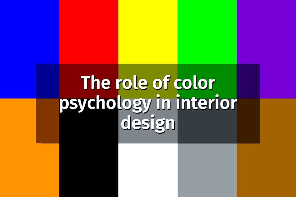
1. Color Perception in the Eye System
Colors are an inseparable part of interior design and influence our emotions and feelings. Research in the field of color psychology in interior design reveals the important role they play in conveying messages and influencing the spatial feeling.
Color is one of the most important tools in facial design.
Yael Golan – Digital Editor
Colors are transmitted to the eye system through the eye’s cones and are then sent to the brain, where they are categorized based on their shade and intensity. When we see a color, our brain creates emotional responses that influence our perception of the color.
For example, warm colors like red and orange can create feelings of love and warmth, while cool colors like blue and green may induce feelings of calmness and tranquility. Each color evokes unique emotions, so it’s important to choose colors that suit the atmosphere you want to create in your space.
Influence of Colors on Emotions and Behavior
Colors deeply and intricately influence emotions and behavior. Each color signifies different emotions and can alter how we act and think. When it comes to interior design, special importance is given to choosing the right colors to create a specific atmosphere and emotion in the space.
Warm colors like red and yellow can evoke feelings of warmth and security. In contrast, cool colors like blue and purple may lead to feelings of calmness and serenity. Therefore, it is important to consider the cultural and personal differences among people, as each individual may respond differently to specific colors.

Colors can also change our behavior positively or negatively. For instance, light and bright colors can reduce levels of stress and anxiety, while dark and heavy colors might lead to feelings of tiredness and irritability.
Therefore, in interior design, it’s crucial to choose colors that match the purpose of the space and the feeling you want to evoke. It’s also advisable to consider the personal preferences of clients and adjust the colors accordingly to create a successful and impressive design experience.
The combination of colors leads to a complete and balanced final result
Abigail Katz – Interior Designer
Main Colors and Sub-Colors in Interior Design
In interior design, main colors serve as essential tools for creating an atmosphere and feeling in a space. They influence the energy, mood, and feelings of the individuals in that space. Each color impacts our emotions differently, so it’s important to choose colors carefully and adapt them to each space most appropriately.

Primary colors like red, blue, and yellow represent different values and emotions. Red symbolizes energy and movement, blue symbolizes calmness and tranquility, and yellow represents optimism and vitality. These colors are excellent for use in various spaces in a home or office and can significantly enhance the atmosphere and mood.
In addition to primary colors, there are also sub-colors that can convey unique emotions and create interesting visual effects. For example, shades of gray and white can evoke a sense of cleanliness and order in a space, and shades of brown and blue can create a warm and pleasant atmosphere. Choosing the right sub-colors can lead to a significant improvement in the aesthetics of the space and the mood of its users.
4. Using Warm and Cool Colors in Interior Design
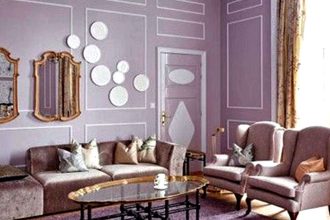
In interior design, using warm and cool colors can enhance the atmosphere in a space and influence the emotions of the people within it. Warm colors like coral, orange, and yellow encourage warmth and intimacy, while cool colors like blue, purple, and green create a clear and calm atmosphere.
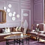
In a living room, using warm colors can create a pleasant and inviting atmosphere. Covering walls in coral color may emit warmth and softness, while using a blue color can create a sense of calmness and tranquility. By combining warm and cool colors, a perfect balance can be achieved that affects the overall feeling of the space.
In bedrooms, warm colors like orange and yellow can assist in creating an atmosphere of pleasantness and tranquility. Additionally, using cool colors like green and purple may help in creating feelings of calmness and serenity that contribute to quality sleep.
In conclusion, using warm and cool colors in interior design can enhance the atmosphere in a space and create an environment of pleasantness, calmness, and intimacy. Through the proper use of colors, it’s possible to influence the emotions of individuals in the space and create a positive and calming design experience.
5. Matching Colors to Space Types and Personal Needs
Matching colors to spaces in a home is a crucial process in interior design, as they influence the atmosphere and feeling in the space. When planning interior design, it’s important to consider the types of spaces and the personal needs of the users. Each space and its requirements vary, so it’s essential to choose colors that perfectly suit each space.
Bedrooms, for example, are spaces where calmness and tranquility are essential. Therefore, it’s advisable to choose neutral and soft colors like white, gray, or light tones. Additionally, dark colors like dark blue or gray can be used to create a sense of calmness.
In workspaces, it’s important to select colors that encourage stability and concentration. Colors like blue or green can be suitable for workspaces. Accent colors in warm tones like red or yellow can add warmth and energy to the space.
In kitchens, it’s advisable to choose colors that promote stability and cleanliness. Colors like white or gray may be suitable for kitchen spaces. Adding accents in warm colors like red or orange can add warmth and energy to the space.
Warm colors give a feeling of warmth and comfort in a space
Daniella Rosen – Interior Designer
Ultimately, matching colors to space types and personal needs is a crucial process in interior design. By choosing the right colors, beautiful, pleasant, and impactful spaces can be created that influence the feeling and atmosphere in the space.
6. Trendy and Stylish Colors in Interior Design
Colors are a central element in interior design that impacts the overall atmosphere and feeling in a space. When planning interior design, it’s essential to be aware of trendy and stylish colors in interior application. The right colors can create a warm, impressive, and stylish atmosphere.
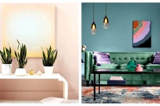
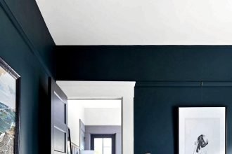
One of the trendy colors in interior application today is the dark and rich color of burgundy. This color provides a sophisticated and luxurious look to a space, particularly suitable for bedrooms and living rooms. Burgundy can be combined with neutral and dark colors to create an elegant and modern appearance.
Another trending and unique color is metallic gold. Gold is an elegant color that adds opulence and luxury to a space. It can be used subtly in items like fixtures, chairs, or accessories to bring sparkle and shine to the space.

Another leading color in interior design is botanical green. This green provides a sense of calmness and harmony to a space, especially suitable for workspaces or spaces where a natural and calming atmosphere is desired.
Choosing trendy and stylish colors in interior design can create a sense of innovation and luxury. By combining the right colors, it’s possible to maximize the space and create a sense of comfort and beauty.
7. Using Colors to Create a Positive and Calming Atmosphere in the Home
In the interior design of our home, the use of colors lies at the heart of the overall atmosphere we want to create in a space. By selecting the right colors, we can generate a positive and calming atmosphere that will influence our mood and that of everyone entering the home.
Light colors such as white, pink, and yellow give a sense of cleanliness and tranquility. They brighten the space and create a feeling of simplicity and cleanliness. When we use these colors in interior design, we can feel calm and serene.
Other mechanisms for creating a positive and calming atmosphere include using natural colors like blue, green, and brown. Brown evokes warmth and homeliness, while blue and green provide a sense of calmness and tranquility. By combining these colors in interior design, a natural and calming atmosphere is created.
Additionally, attention should be paid to matching colors to the various functions of the interior space. For example, bright and refreshing colors can be used in kitchen and bathroom spaces, while warm and deep colors are suitable for the living room and bedrooms.
In summary, using colors correctly can create a positive and calming atmosphere in the home, enhancing the peace and tranquility within. By understanding the impact of colors on us, we can create an attractive and pleasant space that contributes to our overall satisfaction.